BUSINESS CARD ALERT
OOP somebody call the fire department it's getting hot in here.
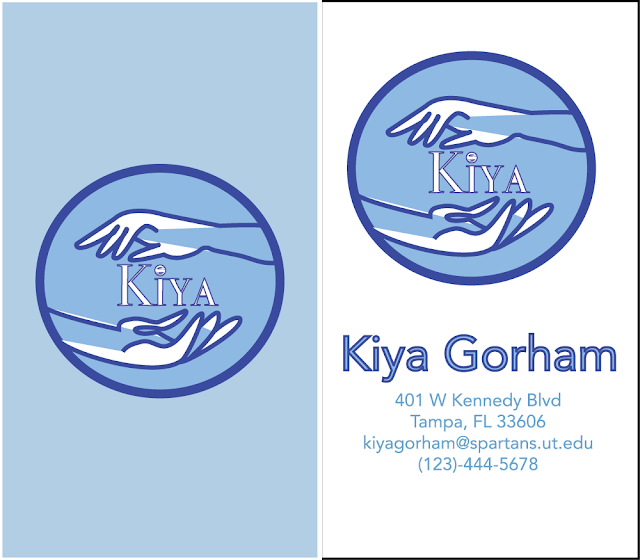
Sooooo let's just say those logos that we were working on in the previous project were used to make our own business cards.
I think mine turned out pretty bomb.
I chose blue because blue is a calming effect but it also represents helping others.
I love the vertical design, BUT here's the horizontal:
Clean, simple, minimalistic, and cute.
Makes you think of the idea of a helping hand.
*cues in the arms of an angel*


Comments
Post a Comment